Typographic Design

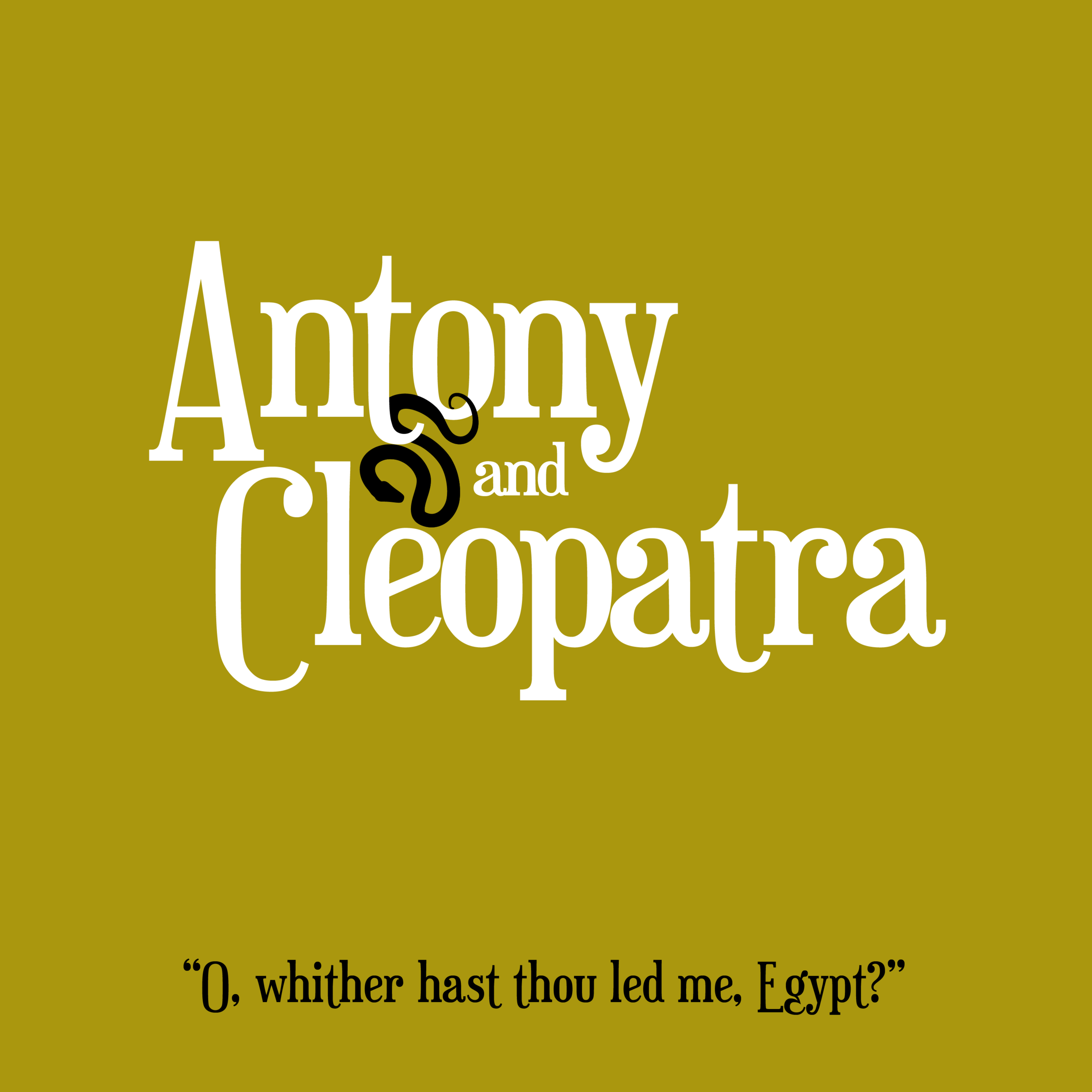
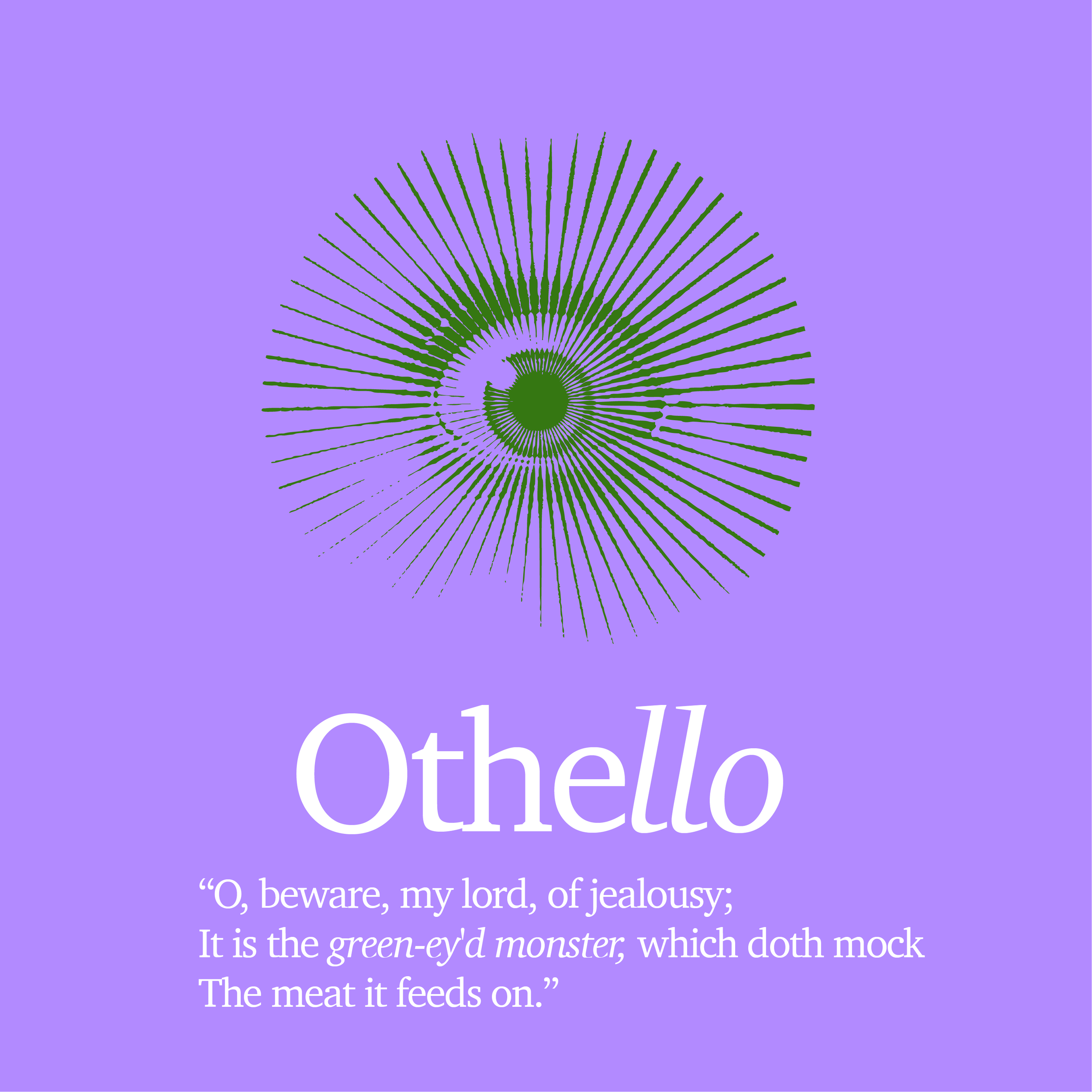
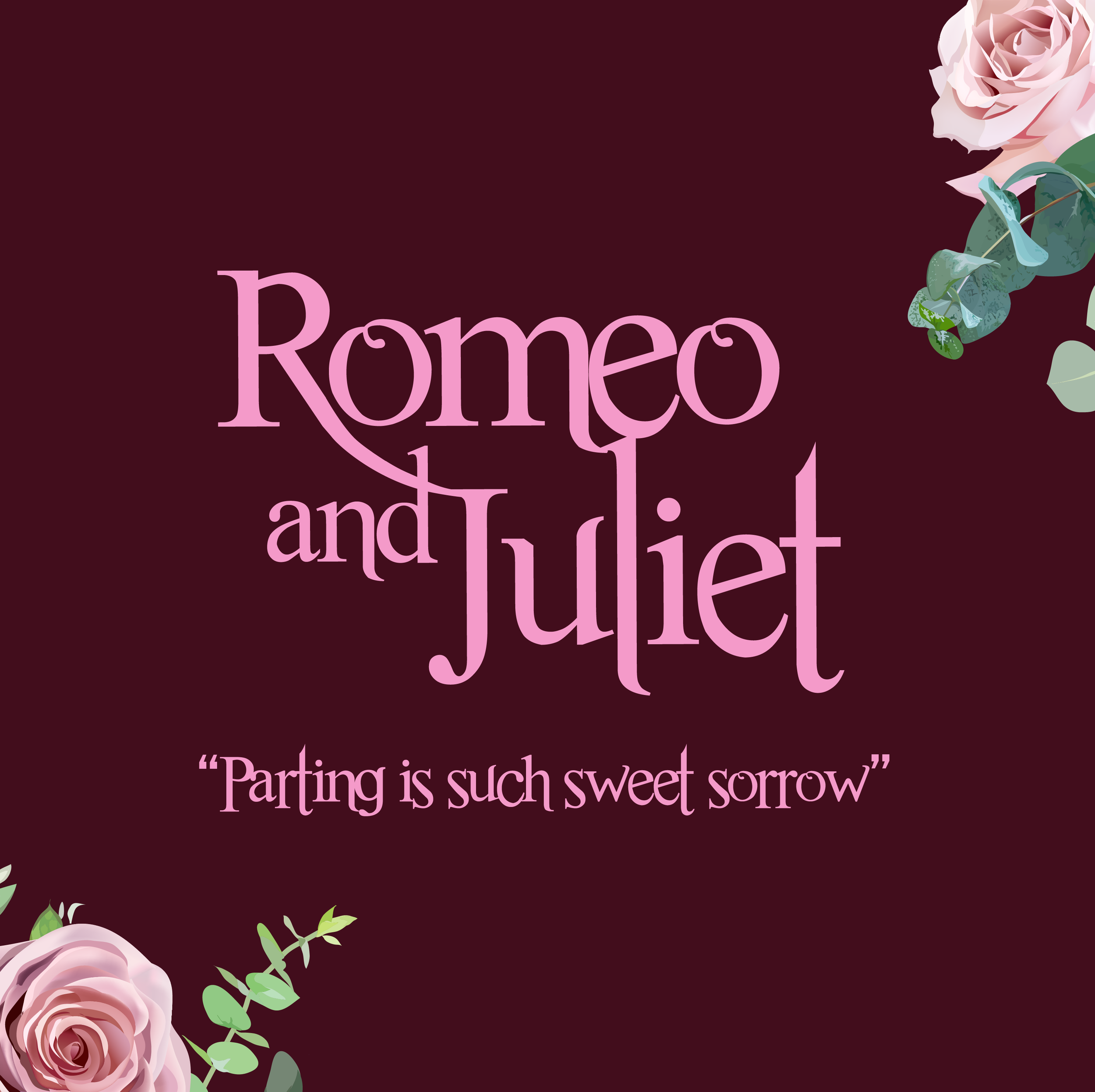
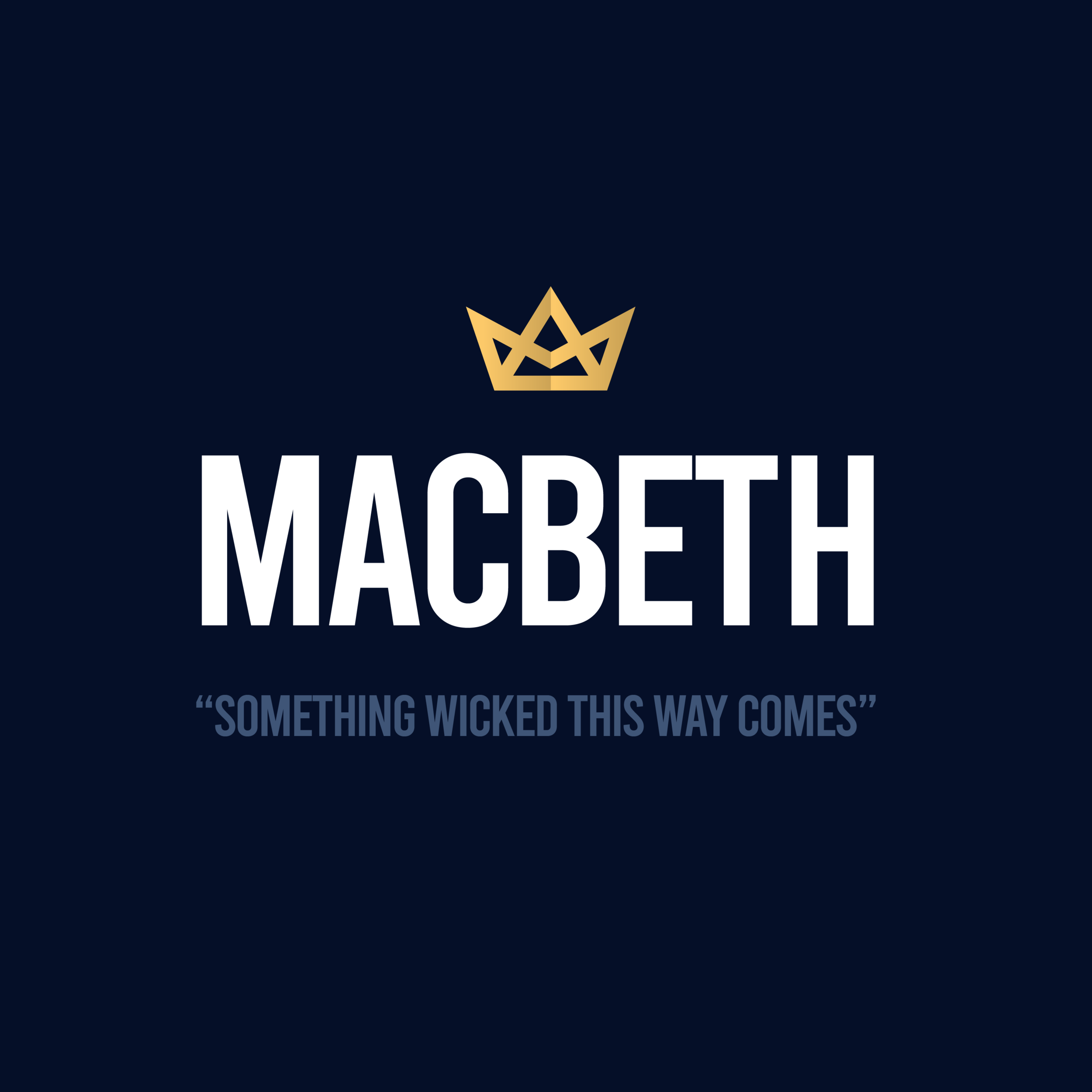
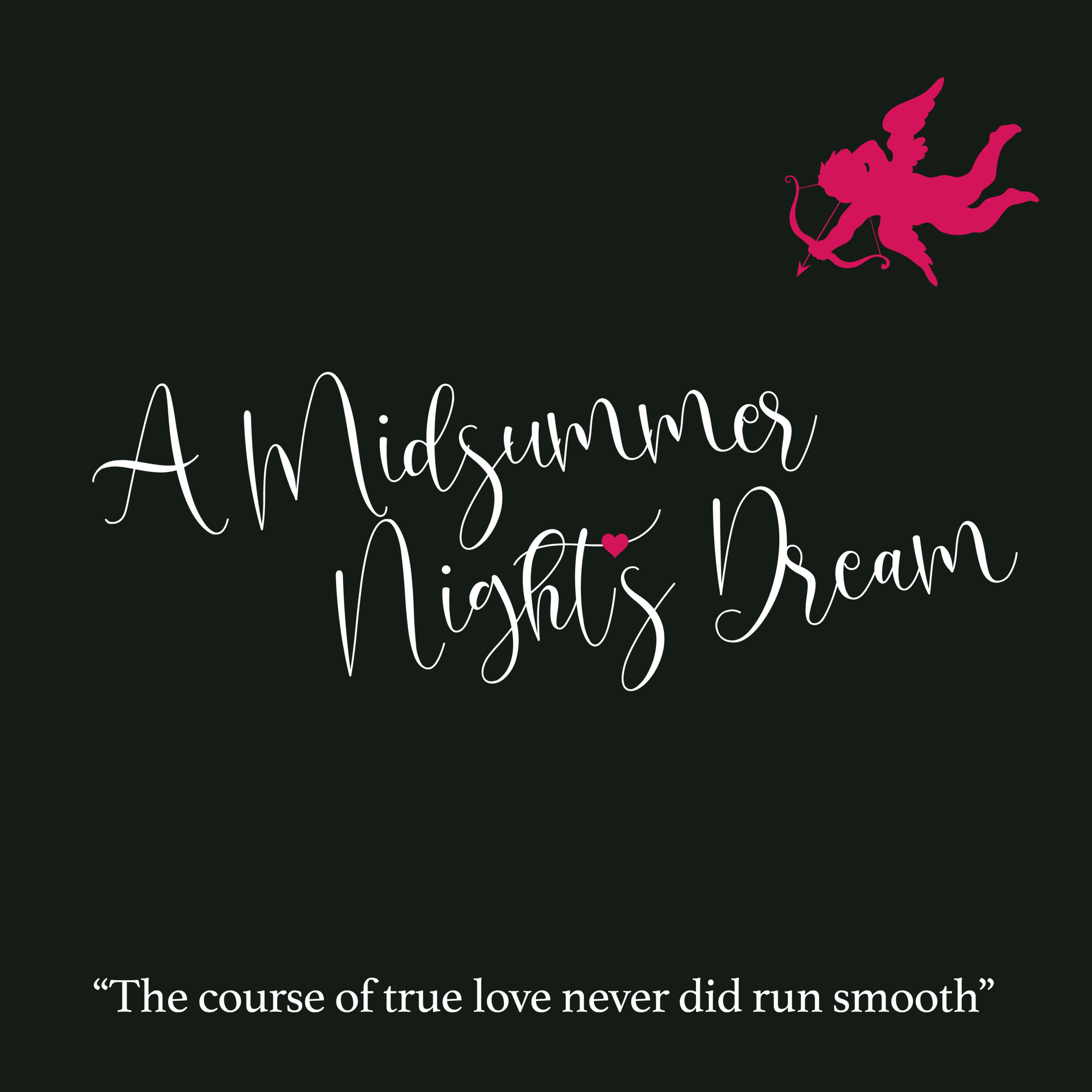
After finishing a book on the collective works of William Shakespeare, I was inspired to design typographic treatments for some of his most iconic works (I originally sketched the Antony and Cleopatra idea back in college twenty years ago … I failed the assignment):

Canadiana: The North

I’ve always been captivated by the majestic beauty of Canada’s north. With skies that appear to dance to the rhythm of one’s heartbeat and glaciers that run as high as they do deep, it is a place of otherworldly landscape.

I am so proud to call this country home.

Prints and other merchandise available at society6.com/oblada.

Up North, Dawn version (©Deborah Clague, 2019).

Up North, Dawn version (©Deborah Clague, 2019).

Up North, Night version (©Deborah Clague, 2019).

Up North, Night version (©Deborah Clague, 2019).

Saskatchewan

Another new vintage travel poster design, this time showcasing the “land of living skies” (and my current home), Saskatchewan. I am hoping to eventually turn this into a series of prints representing how the spirit of the province weaves through the landscape, wildlife and culture.

And yes, the first design required a moose.

Saskatchewan (©Deborah Clague)

Saskatchewan (©Deborah Clague)

Social Portfolio

In the creative industry, one always looks for different ways of doing things. In the past, I’ve lugged around a traditional leather-bound portfolio which safely guarded the few print pieces I’ve kept over the years. And, of course, I have this here website to update with projects that I’m proud of and want to share. But as social media becomes the dominant presence in the digital age, I felt I needed to update and showcase my work in a different way.

With a bit of inspiration from fellow designer Ji Lee, I am re-imagining how to showcase my body of work.

Visit and follow my new creative grid portfolio at instagram.com/obladacreative for the full experience.

ObladaCreative.jpg

Redgee Awards

Very proud to win "Best in Region" at the 2016 Canadian Regional Design Awards, the Redgees. Saskatchewan Polytechnic received top honours for the Prairies (Saskatchewan/Manitoba/Nunavut) for design work on the 2017/18 Viewbook. The piece – which merged traditional print with augmented reality – will also be showcased in an upcoming issue of national magazine, DesignEdge. Winners were announced at a ceremony in Toronto on November 2. 

The Redgee Awards are the most comprehensive collection of work from Canada's professional creative communities. 

The Power of Good Design

I talked about Korean design previously, but came across something this weekend that further demonstrated how the country's creative talent is turning it up a notch … with something as seemingly mundane as CD packaging. South Korea is still a big market for physical music sales and I can't help but think that the effort gone into their presentation plays a big factor into it. Take a look at this video of a North American fan opening an EXID CD for the first time:

Do a Youtube search on any k-pop artist and you will find hundreds of similar videos of the western youth demographic marvelling at the detail put into these pieces. Videos that don't actually play any of the artists' music; just focus on the presentation and the thrill of being immersed in a brand. This is the power of good design. 

Oblada: a decade ago

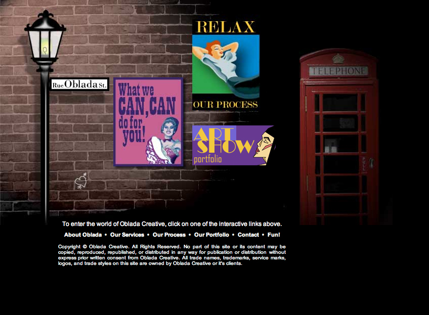
I was reminiscing about various things yesterday and thought I would look up my old website on the Internet Archive Wayback Machine

I had a lot of fun designing this back in 2003. It was my primary introduction to potential clients; within a year, I left my full-time agency gig to start my own creative services "boutique". Working from home and doing what I love, often in sweatpants, was nothing short of living the dream. 

I wanted my site to be like a book and had a splash landing page acting as a cover...which is where my logo was. Yikes at it not being featured anywhere here! I don't think SEO was a thing back then (if it were, I wasn't paying attention) which is why I made all of my links graphics that incorporated elementary rollover tecniques. Style was still very much me though. Street art and the gallery of the urban landscape still very much influence everything I do.